Preciosa Joias
A jewelry store with an amateur brand that didn't match the standard of the pieces it sold.
01
Reading
Preciosa sells high-standard jewelry and fashion jewelry, bought for personal use and as gifts: wives, girlfriends, birthdays. It sells in a physical store, on social media and on its website.
The previous brand was amateur and didn't match the reality of the business. That is what the client wanted to solve.
02
Thesis
The company looked like less than it was. The work was to give it an identity worthy of what it already delivered.
Customers decide by what they can see. An amateur brand makes a company look smaller than it is, even when the product and the service are at the level it promises.
03
Decision
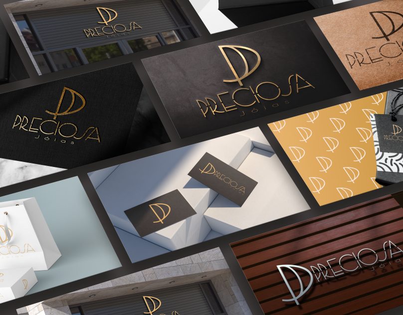
The symbol starts from an idea that serves those who buy as a gift: a P and J monogram that can recall two interlocked rings, around union and commitment. The idea was proposed in the project.
The name comes in thin-stroke geometric letters, with main, horizontal and symbol-only versions, to work from the packaging to the website header.
04
System
- Monogram and logo versions, in color and in one color.
- Pattern built from the symbol itself, for documents, cards and presentations.
- Palette combining shades of gold with blue and gray.
05
In use
The system was presented on a box, bag, tag, stamp, cards and signage. The applications shown are simulations.